6 Time series components
This chapter discusses basic time series components that a forecasting model must incorporate, like the level, the trend and seasonality. While the next chapter will discuss decomposing the time series into components more explicitly, this chapter provides a basic familiarity with these components.
Plotting a time series is an excellent first step to identifying these components. This chapter describes some typical plots useful for visualizing univariate time series data. Such graphs may also surprise you by revealing unexpected data structures.
6.1 Level
The level of a time series describes the center of the series. If we could imagine the time series without random noise, trend, and seasonality, the remainder would be the level. Using a time plot, we illustrate this thought process on the left-hand side of Figure 6.1. A time plot means that we plot the variable against time. The plot on the right-hand side of Figure 6.1 shows a time series with random variations around the level. This plot is more realistic because some randomness influences every observation.
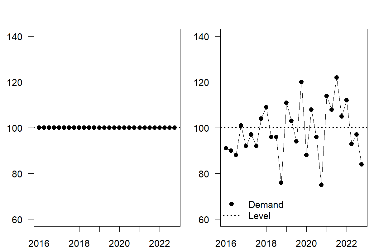
Figure 6.1: Time series with a level only (left), and a level and random noise (right)
6.2 Trend
A trend describes predictable increases or decreases in the level of a series. A time series that grows or declines in successive periods has a trend. We illustrate this time series component in Figure 6.2 with an increasing (left-hand) and decreasing (right-hand) trend. By definition, trends need to be somewhat stable to allow predictability. It is often challenging to differentiate a trend from abrupt shifts in the level, as discussed in Chapter 4. If one reasonably expects the level shift to reoccur similarly in the following period, one can speak of a trend instead of an abrupt level shift. A long-run persistence of such increases/decreases in the data is necessary to establish that a real trend exists.
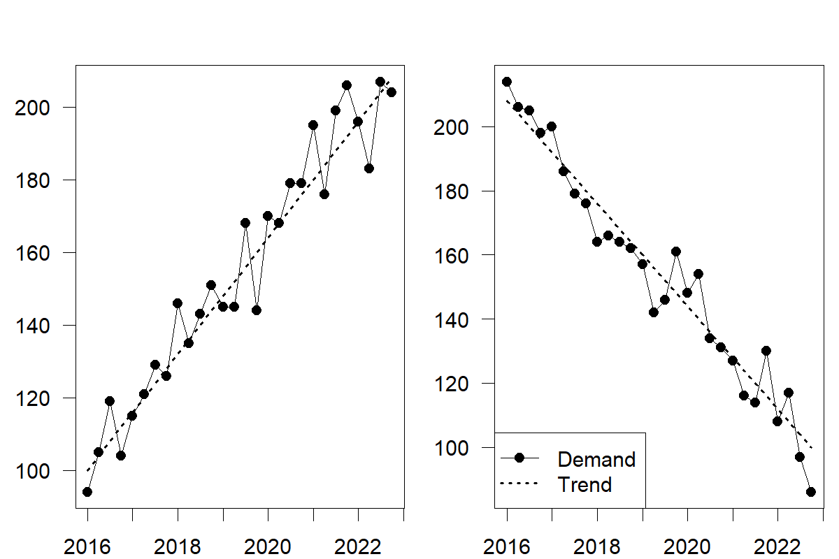
Figure 6.2: Time series with an increasing (left) and decreasing (right) trend
A trend in the time series can have many underlying causes. At the beginning of its lifecycle, a product will experience a positive trend as more and more customers receive information about the product and decide to buy it. On the upside of the business cycle, the gross domestic product expands, making consumers wealthier and more able to purchase. More fundamentally, the world population is growing by about \(1\%\) yearly. To some degree, a firm that sells products globally should observe this global population increase as a trend in their demand patterns.
Trends can also be either linear or non-linear. Linear trends are positive or negative additive increments to the series level. An additive trend implies a linear increase/decrease, that is, an increase/decrease in demand by \(X\) units in every period. Non-linear trends are often multiplicative, with increments proportional to the previous series value(s). A multiplicative trend implies an exponential increase/decrease, that is, an increase/decrease in demand by \(X\) percent in every period. Multiplicative trends tend to be easier to interpret since they correspond to statements like “our business grows by 10% every year”; however, if the trend does not change, such a statement implies unbounded exponential growth over time. We can expect such growth patterns in the early stages of a product lifecycle. Still, time series models using multiplicative trends must pay extra attention to not set such growth in stone but allow it to taper off over time.
6.3 Seasonality
Seasonality is a consistent pattern that repeats over a fixed cycle. For example, in a daily time series, the cycle may repeat itself every 7 days (a weekly seasonal pattern). Patterns over 7 days should look similar from week to week. Other examples of seasonality include predictable increases in demand for consumer products every December for the holiday season or higher demand for air-conditioning units or ice cream during the summer. A company’s regular promotion event in May will also appear as seasonality.
The strength of seasonality often depends on the time granularity (see Section 15.1). Data on yearly granularity usually has little seasonality. While leap years create a regularity that reappears every 4 years by including an extra day in the year, this effect is small enough to be ignored. Temperature often influences data on sub-yearly granularity. Weekly or daily data can additionally be subject to day-of-the-week, payday, billing cycle, and end-of-month effects (Rickwalder, 2006). Hourly data will often have visible time-of-the-day effects. Various factors, such as weather patterns, administrative measures, and social, cultural, and religious events, may cause seasonalities. Some calendar-related effects may change and fall in different months from year to year, such as Easter. All these effects are treated as seasonality in time series forecasting since they represent predictable recurring patterns over time. There can also be more complex seasonal patterns, which we address in Chapter 15.
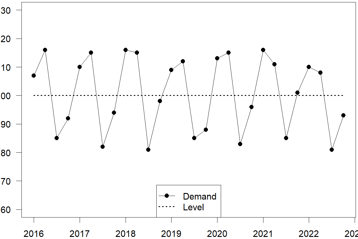
Figure 6.3: A time series with level and additive seasonality
Additive vs. multiplicative seasonality
Seasonality can appear in two forms: additive and multiplicative. In the former case, the magnitude of seasonality does not change relative to the series level. In the latter, seasonal fluctuations increase or decrease proportionally with increases and decreases in the level. We illustrate additive and multiplicative seasonality in Figure 6.4. You will notice the difference in the peak and trough amplitudes. Specifically, the amplitude of the seasonal component of the multiplicative time series changes with the trend.
Additive seasonality usually applies to more mature products with relatively little growth. In contrast, multiplicative seasonality naturally incorporates growth in a series, particularly in contexts where the effect of seasonality depends on the scale of demand. Differentiating between additive and multiplicative forms of trend and seasonality is vital for the general Exponential Smoothing framework we discuss in Chapter 9.
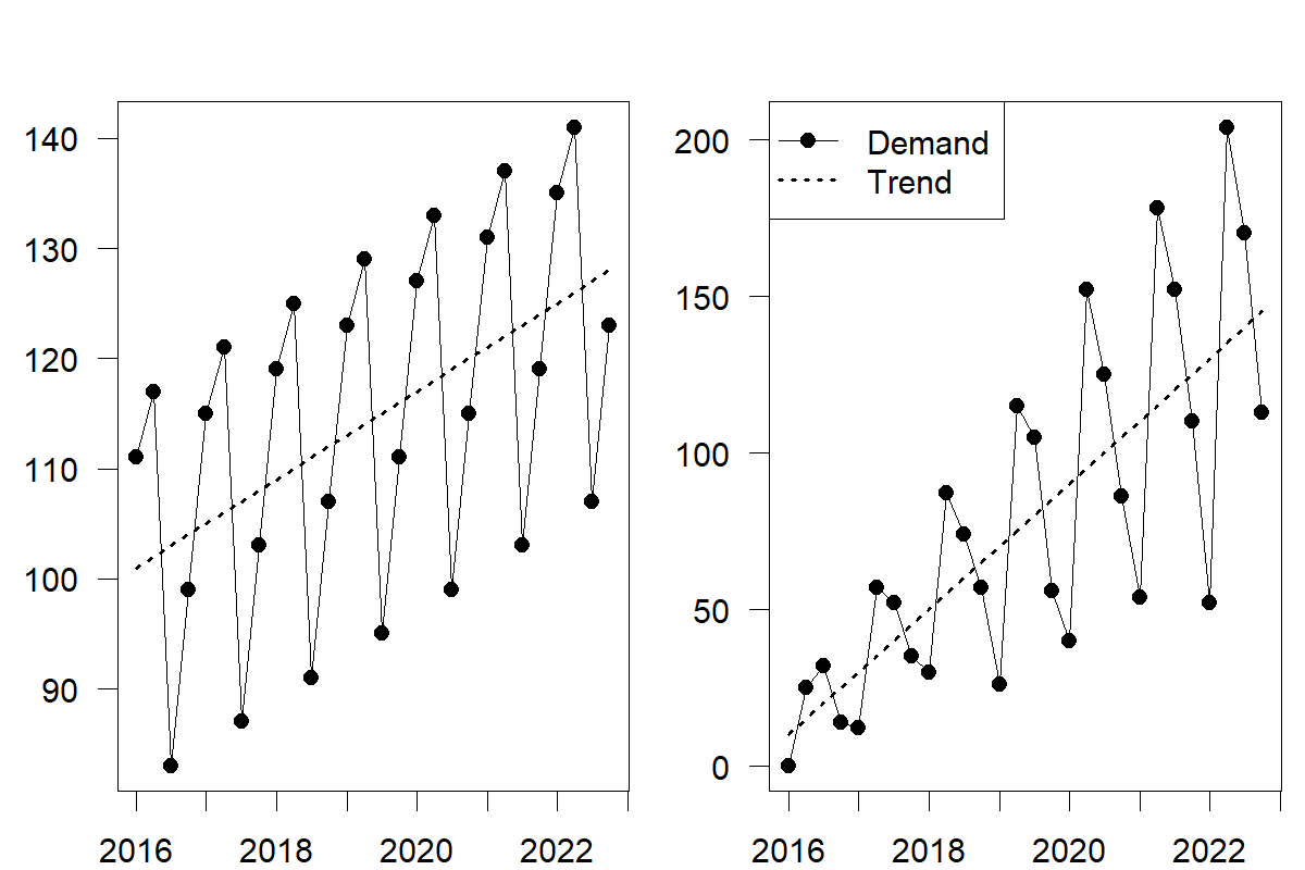
Figure 6.4: Time series with an increasing trend and additive (left) and multiplicative (right) seasonality
Seasonal and seasonal subseries plots
Identifying the seasonal pattern by observing only a time series plot can be challenging. A seasonal plot (also known as a seasonplot) can be more helpful. In a seasonal plot, we plot the data against the “seasons” in which we observed them, with one line per full cycle. This plot allows us to spot the underlying seasonal pattern and possible changes in this pattern. We plot the same data as before in Figure 6.3 as a seasonal plot.
We also exhibit a seasonal subseries plot, which works a little differently. Here, we collect and plot observations based on their “season” (quarters 1 to 4 for quarterly data, weekdays for daily data) against the cycles in separate time sub-plots. We also show the mean for each season as a horizontal line. Such a plot is especially useful in identifying changes within seasons from cycle to cycle.
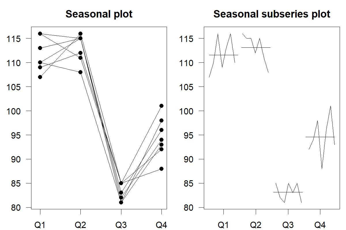
Figure 6.5: A seasonal (left) and a seasonal subseries (right) plot for the time series shown in Figure 6.3
We can generate seasonal plots and seasonal subseries plots with functions in the forecast (Hyndman et al., 2023) and feasts (O’Hara-Wild et al., 2022) packages for R.
6.4 Cyclical patterns
Some series may exhibit cyclical behavior that does not reoccur in fixed intervals. Such effects are often due to the economic cycle. Economic expansions follow economic recessions. While this boom and bust cycle repeats itself, the length of each cycle is unknown. Figure 6.6 shows the time series of cement production in Australia between 1980 and 2014 (Hyndman et al., 2023). We can observe growth and decline cycles that follow the economy’s state.
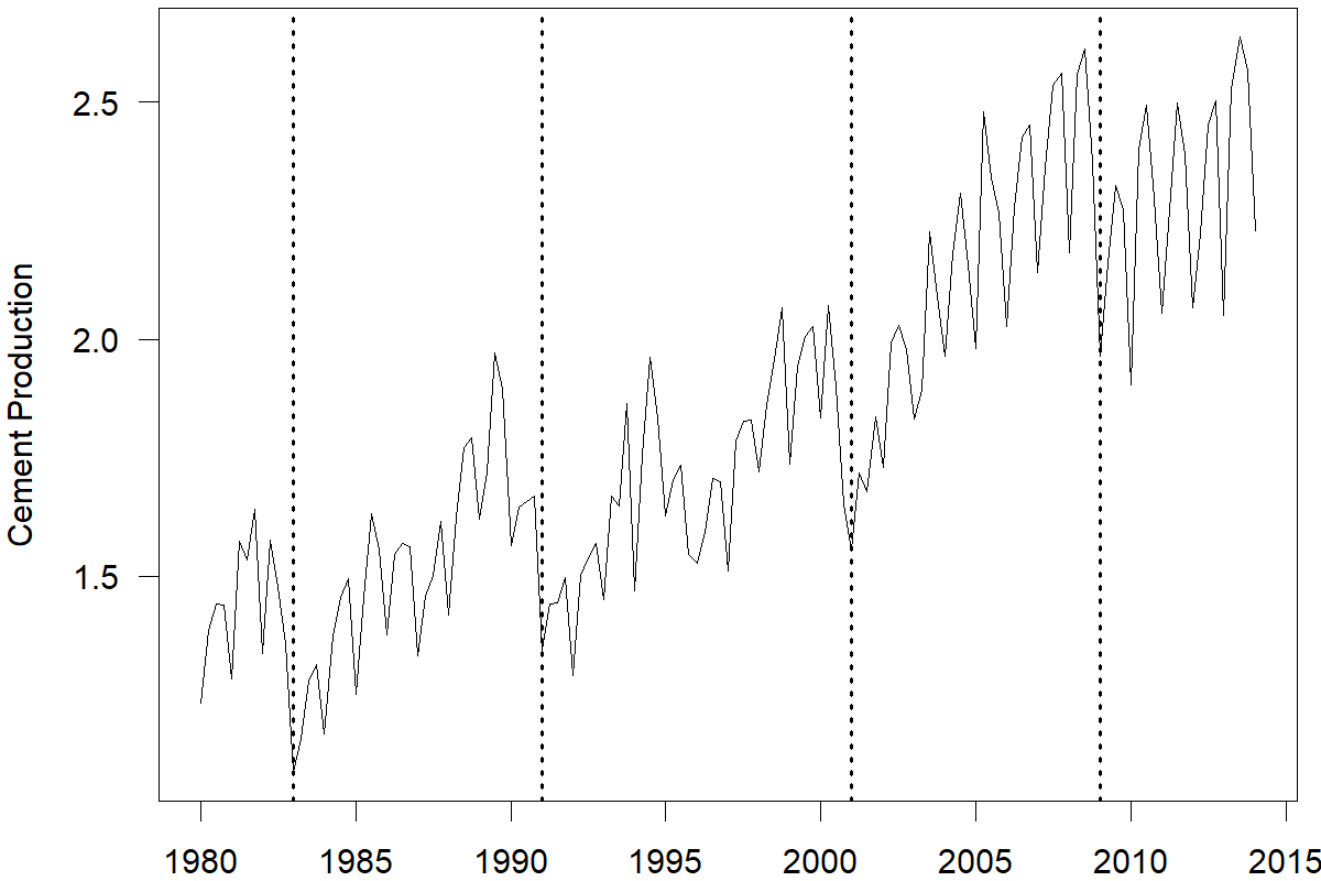
Figure 6.6: Cement production in Australia (millions of tonnes). Business cycles in the early 1980s, 1990s, 2000s, and around 2008 are demarcated by vertical dotted lines
Distinguishing cyclical patterns from seasonal ones can be confusing since both patterns comprise rises and falls in the series. A seasonal pattern is strictly regular, meaning that the distance between the peaks and troughs of the series is the same (e.g., every 4 quarters, 12 months, 7 days, 24 hours, etc.). Cyclical patterns are not as regular. They can drift over time, and the distance between rises and falls is not fixed. Cyclical patterns may occur over multiple years. Time series can combine both cyclical and seasonal patterns. For instance, the time series of cement production shown in Figure 6.6 has a cyclical effect due to the market conditions and a seasonal effect likely induced by the change in weather conditions, which drive seasonality in construction.
6.5 Other characteristics of time series
Another essential characteristic of a time series is the association between demand at the current period and previously observed demands. A scatterplot allows you to graph an observation against a prior observation. For example, you could plot demand in period \(t\) against demand in period \(t-1\). Such a scatterplot is also called a lag plot, because you are plotting the time series against lags of itself. A time series with lag 1 is a version of the original time series that is one period behind in time.
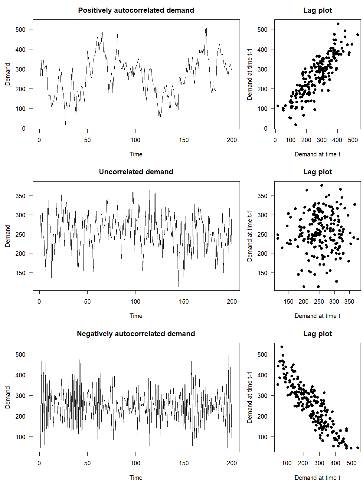
Figure 6.7: Lagged scatterplots for simulated time series with positive, zero or negative autocorrelation
If a time series shows a correlation with a lagged version of itself, it is said to exhibit autocorrelation (from Greek auto, meaning “self”). The correlation between a series and itself lagged by 1 step is the lag 1 autocorrelation, and in a similar way, we can have lag 2, 3, etc. autocorrelations. An autocorrelation shows up as a correlation in lag plots like Figure 6.7.
Intuitively, autocorrelation implies that the current demand can help predict the immediate future. Thus, assessing autocorrelation and incorporating previous lags into models can lead to more accurate forecasts, especially for datasets where trends and seasonalities are difficult to determine precisely. We discuss ARIMA models that account for autocorrelation in Chapter 10.
Another characteristic that we see in a time series is randomness. Time series can consist of systematic patterns (i.e., trend, seasonality, autocorrelation) and random variations. For example, a time series of air pollution might have day-of-week effects based on traffic or commuting patterns and some randomness. Some time series rise and fall with no apparent trend, seasonality, or autocorrelation. Time series without any patterns at all are called white noise, meaning that the nature of the process generating the data is inherently random, unknown, and unpredictable (except possibly for an overall level).
6.6 Visualizing time series features
The previous section outlined how to understand the components of individual series. While plotting and inspecting time series is valid, this process can be cumbersome for large-scale (e.g., thousands or millions of time series) forecasting tasks. Instead of plotting the individual series, you can quantify their structure by computing, plotting and analyzing several numerical summary statistics called time series features (not to be confused with “features” in the sense of predictors or explanatory variables, see Chapter 11).
We have already seen some time series features. We introduced basic features, such as the average (\(\mu\)) and standard deviation (\(\sigma\)), in Section 6. Given these two features, you can compute the coefficient of variation (CV) as a new feature that measures the variability of a time series, where \(\text{CV}= \sigma / \mu\). A \(\text{CV} < 1\) indicates that the standard deviation is smaller than the average, while a \(\text{CV} > 1\) indicates that the standard deviation is greater than the average. Higher values of CV correspond to high variability in the time series. We can use the CV as a measure of “forecastability,” with a higher CV being in general less forecastable (see Section 5.5). Besides the CV, forecasters apply other features, like, e.g., the entropy, to quantify the forecastability of time series data instead (Kang et al., 2017).
Another time series feature we have previously discussed is the autocorrelation at various lags from Section 6.5. This feature captures the strength of the linear relationship associated with each lag plot as shown in Figure 6.7. Autocorrelations vary between \(-1\) and \(+1\). Autocorrelations closer to zero indicate little linear relationship between a time series and its previous lags. An autocorrelation coefficient close to \(-1\) or \(+1\) indicates a stronger linear association.
We can also compute the strength of the trend and the seasonality as features of a time series. Typical definitions calculate these strengths as a numerical value between 0 and 1 (Hyndman and Athanasopoulos, 2021). A feature closer to 1 indicates a stronger trend and seasonality. These measures can be helpful when analyzing an extensive collection of time series.
We illustrate these features with the example of a dataset containing 1,224 monthly time series demand of three types of medical products in nine regions over the past couple of years. Plotting all these series using time series graphs is not practical. However, we can compute the CV for each series and plot a histogram of all these CVs to visualize the variability of our data. We illustrate this approach in Figure 6.8.
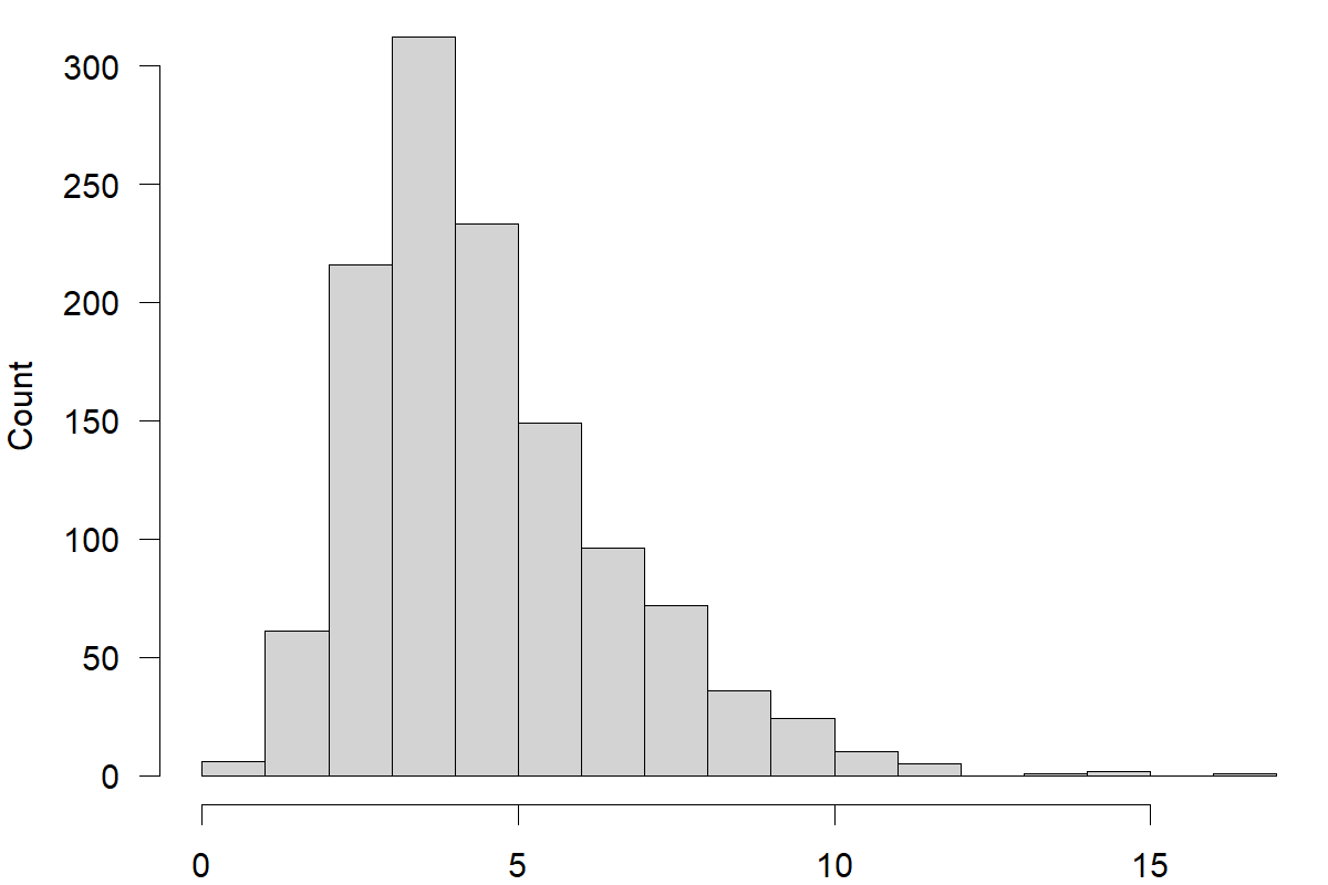
Figure 6.8: A histogram of coefficients of variation for 1,224 time series of medical product demand
The histogram reveals high variability in the medical product demand time series, indicating potential challenges in producing accurate forecasts. A few time series on the left show lower CVs, but most time series have high CVs.
As a next step, we can compute the strengths of trend and seasonality for each series and visualize them. Figure 6.9 is a scatterplot of seasonal strength versus trend strength. Each sub-plot contains time series for each region, and each point corresponds to one time series with different shapes corresponding to different types of medical products. Demand in most regions is not seasonal, except for Region F, where we can observe high seasonality for product type 1. Many regions exhibit a trend. Regions A, D, and E trends seem less strong compared to the other regions.
Figure 6.9: Strength of seasonality vs. strength of trend for all time series of the demand data
We can use these features to identify any series plotted in Figure 6.9. You can, for example, explore the time series with no trend and seasonality or those with the strongest trend or seasonality features. For instance, we identified a series with the highest seasonality in the medical product demand data, which belongs to product type 1 in region F. We visualize this series in Figure 6.10.
Figure 6.10: The time series with the strongest seasonality among the medical product demand series
Key takeaways
Using a time plot is an excellent way to begin understanding your time series data.
Time series data can comprise systematic information, including level, trend, seasonality, and autocorrelation.
The trend and seasonality patterns can be additive or multiplicative. Multiplicative components increase growth/decline patterns over time, whereas additive components imply a more linear growth/decline of firms.
Seasonal and seasonal subseries plots are helpful graphs to reveal seasonality.
Lag plots are an essential tool to understand the association between current and previous observations in time series, i.e., autocorrelation.
Unpredictable randomness is an inherent part of any time series.
When analyzing and forecasting an extensive collection of time series, extracting and plotting numerical time series features helps uncover useful information.