4 A simple example
To bring forecasting to life, our objective in this chapter is to provide readers with a simple example of applying and interpreting a statistical forecasting method in practice. This example is stylized and illustrative only. In reality, forecasting is messier, but this chapter serves as a guideline for thinking about and successfully executing and applying a forecasting method for decision-making.
4.1 A point forecast
Suppose you are interested in predicting weekly demand for a particular product or service. Specifically, we have simulated historical data from the past 50 weeks and want to get a forecast for how demand for your product will develop over the next 10 weeks, i.e., weeks 51 to 60 (see Figure 4.1). Completing this task means making ten different forecasts; the one-step-ahead forecast is your forecast for week 51, the two-step-ahead forecast is your forecast for week 52, and so forth. We will assume that we know that the data has no trend or seasonality (since we simulated it, we know this is true) to keep things simple. Trends and seasonality are predictable patterns in the data. We will examine them in more detail in Chapter 7. Further, no additional market information is available beyond this demand history (Chapter 11 will examine how to use additional information to achieve better predictions). We show a time series plot of our data in Figure 4.1.
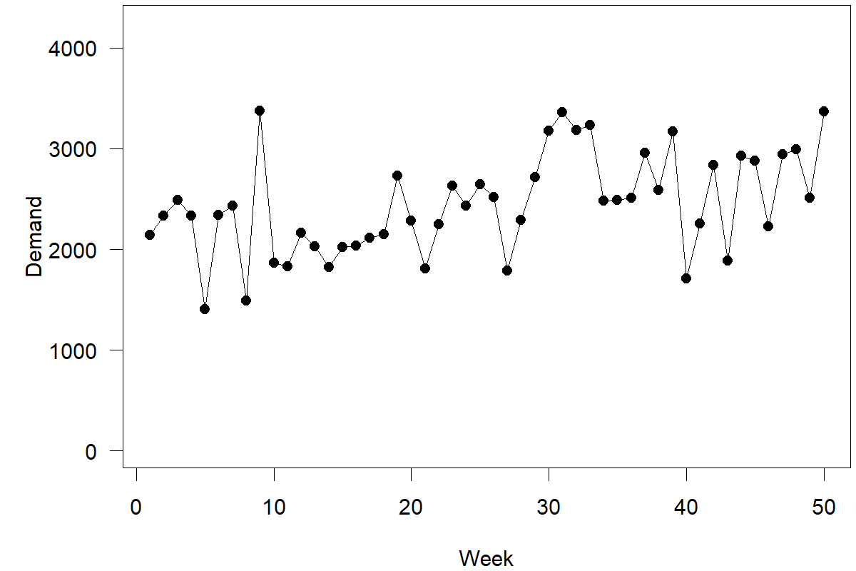
Figure 4.1: Time series for our example
Here are two simple approaches to create a point forecast (we cover simple forecasting methods in more detail in Chapter 8): either take the most recent observation of demand (= 3370) or calculate the long-run average over all available data points (= 2444). Both approaches ignore the distinct shape of the time series; note that the series starts low and then exhibits an upward shift. Calculating the long-run average ignores the observation that the time series currently hovers higher than in the past. Conversely, taking only the most recent demand observation as your forecast misses that the last observation in the series is close to an all-time high. Historically, an all-time high in the series usually does not signal a persistent upward shift but is followed by lower demands in the following weeks. This sequence of events is a simple case of regression to the mean.
We could, of course, split the data and calculate the average demand over the last 15 periods (= 2652). Not a wrong approach – but the choice of how far back to go (= 15 periods) seems ad hoc. Why should the last 15 observations receive equal weights while those before receive no weight? Further, this approach does not fully capture the possibility that we could encounter a shift in the data; going further back into the past allows your forecast – particularly our prediction intervals – to reflect the uncertainty of further shifts in the level of the series occurring.
A weighted average over all available demand data would solve these issues, with more recent data receiving more weight than older data. What would be good weights? If I have 50 time periods of past data, do I need to specify 50 different weights? It turns out that there is a simple method to create such weighted averages, which also turns out to be the correct forecasting method to use for this kind of time series: (Single) Exponential Smoothing (SES). Chapter 9 will provide more details on this method; for now, we just need to understand that a vital aspect of this method is that it uses a so-called smoothing parameter \(\alpha\) (alpha). The higher \(\alpha\), the more weight is given to recent as opposed to earlier data when calculating a forecast. The lower \(\alpha\), the more the forecast considers the whole demand history without heavily discounting older data. The more basic implementations of Exponential Smoothing require the user to specify \(\alpha\), but more sophisticated ones will optimize this parameter instead.
Suppose we feed the 50 time periods of this time series into one of these more sophisticated Exponential Smoothing tools to estimate an optimal smoothing parameter. In that case, we will obtain an \(\alpha\) value of 0.15. This value indicates some degree of instability and change in the data (which we see in Figure 4.1).
Now you are probably thinking: Wait! I have to create a weighted average between two numbers, where one of these numbers is my most recent forecast. But I have not made any forecasts yet! If the method assumes a current forecast and I have not made forecasts in the past using this method, what do I do? The answer is simple. We use the most recent model or in-sample fits. In other words, suppose we had started in week 1 with a naive forecast of your most recent demand and applied the SES method ever since to create forecasts. What would have been your most recent forecast for week 50? Figure 4.2 depicts these in-sample fits.
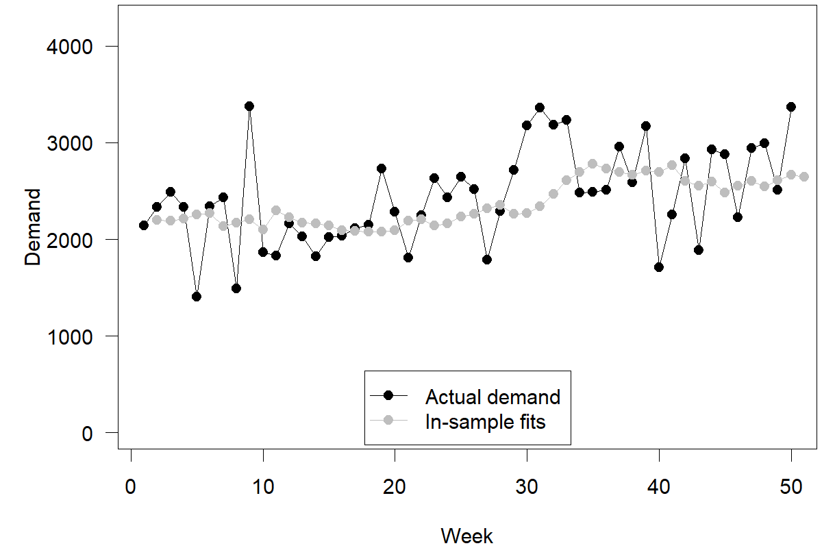
Figure 4.2: Model or in-sample fits for our example
These in-sample fits are not actual forecasts. First, we used the data from the last 50 weeks to estimate a smoothing parameter. Then, we used this parameter to generate fitted forecasts for the previous 50 periods. We would not have known this smoothing parameter in week 1 since we did not have enough data to estimate it. Thus, the recorded fitted forecast for week 2, supposedly calculated in week 1, would not have been possible to make in week 1. Nevertheless, this method of generating fitted forecasts now allows us to make a forecast for week 51. Specifically, we take our most recent demand observation (= 3370) and our most recent “fitted” forecast (= 2643) and calculate the weighted average of these two numbers (\(0.15\times 3370+0.85\times 2643=2752\)) as our point forecast for week 51.
So, what about the remaining nine point forecasts for periods 52 to 60? The answer is surprisingly simple. The SES model we are using here is a level only model. Such a model assumes that there is no trend or seasonality (which, as mentioned initially, is correct for this time series since we constructed it with neither trend nor seasonality). Without such additional time series components (see Chapter 7), the point forecast for the time series remains flat, i.e., the same number. Moving further out in the time horizon may influence the spread of our forecast probability distribution. Still, in this case, the center of that distribution and the point forecast remains the same. Our forecasts for the next 10 weeks are thus a flat line of 2752 for weeks 51 to 60. Our two-step-ahead, three-step-ahead, and later point forecasts equal our one-step-ahead point forecast.
Our intuition may tell us that this is odd; indeed, intuitively, many believe that the shape of the series of forecasts should be similar to the shape of the time series of demand (Harvey, 1995). Yet this is one of those instances where our intuition fails us; the time series contains noise, which is the unpredictable component of demand. A good forecast filters out this noise (an aspect that is visible in Figure 4.2). Thus, the series of forecasts should be less variable than the time series of demand. We do not know whether the time series will shift up, down, or stay at the same level. Without such information, our most likely demand prediction falls into the center. We must keep a prediction that the time series stays at the same level. Thus, the point forecast remains constant as we predict further into the future. Only the uncertainty associated with this forecast may change as our predictions reach further into the unknown.
4.2 Prediction intervals
So how to calculate a prediction interval associated with our point forecasts? We will use this opportunity to explore three different methods of calculating prediction intervals:
- using the standard deviation of observed forecast errors,
- using the empirical distribution of forecast errors,
- using theory-based formulas.
The first method is the simplest and most intuitive one. Calculating the errors associated with our past in-sample fits is easy by calculating the difference between actual demand and fitted forecasts in each period. We calculate the standard deviation of these forecast errors (\(\sigma=466.51\)). This value represents the spread of possible outcomes around our point forecast (see Figure 3.1). If we want to calculate a prediction interval around the point forecast, we use this number in a calculation as given in Section 3.1. For instance, to obtain an 80% prediction interval in Microsoft Excel, we use the formulas =NORM.INV(0.90, 2752, 466.51) and =NORM.INV(0.10, 2752, 466.51), for a result of \((2154, 3350)\). In other words, we can be 80% sure that demand in week 51 falls between 2154 and 3350, with the most likely outcome being 2752.
Method (1) assumes that our forecast errors roughly follow a normal distribution; method (2) does not make this assumption but generally requires more data to be adequate. An 80% prediction interval ignores the top and the bottom 10% of errors we can make. Since we have approximately 50 “fitted” forecast errors, ignoring the top and the bottom 10% of our errors roughly equates to ignoring the top and the bottom five (=\(10\%\times 50\)) errors in our data. In our data, the errors within these boundaries are (–450; 582). Therefore, another simple way of creating an 80% prediction interval is to add and subtract these two extreme errors to and from the point forecast to generate a prediction interval of (2302, 3334), which is a bit more narrow than our previously calculated interval from method (1). In practice, bootstrapping techniques exist that increase the effectiveness of this method in terms of creating prediction intervals.
The final method (3) only exists for forecasting methods with an underlying statistical model – like the SES method we used in Section 4.1. For such methods, one can use the appropriate formula to calculate the standard deviation of the forecast error and derive a prediction interval. For example, in the case of SES, the procedure for this calculation is simple: If one predicts \(h\) periods into the future, the standard deviation of the forecast error for this prediction is the one-period-ahead forecast error standard deviation, as calculated in method (1), multiplied by \(1+(h-1)\times \alpha^2\). Similar formulas exist for other methods but can be more complex; your forecasting software should be able to apply the correct calculations.
How does one generally calculate the standard deviation of forecast errors that are not one step ahead but \(h\) steps ahead? Suppose we prepare a forecast in week 50 for week 52 and use the standard deviation of forecast errors for one-step-ahead forecasts resulting from method (1). In that case, our estimated forecast uncertainty will generally under-estimate the actual uncertainty in this two-step-ahead forecast. Unless the time series is entirely stable and has no changing components, predicting further into the future implies a higher likelihood that the time series will move to a different level. The formula mentioned in method (3) would see the standard deviation of the one-step-ahead forecast error for period 51 (= 466.51) increase to 477.65 for the two-step-ahead forecast error for week 52 and 488.80 for the three-step-ahead forecast error for week 53. Prediction intervals increase in width accordingly.
Another approach would be calculating the two-step-ahead fitted forecasts for all past demands. In the case of Single Exponential Smoothing, the one-step-ahead forecast equals the two-step-ahead forecast. Still, our error calculation now requires comparing this forecast to demand one period later. The resulting error standard deviations for the two-step-ahead forecast (= 480.02) and three-step-ahead forecast (= 503.87) are higher than those for the one-step-ahead forecast and the adjusted standard deviations using the formula from method (3).
Forecasting software will usually provide one or more of these methods to calculate prediction intervals and will allow visualizing them, e.g., in a fan plot. For instance, Figure 4.3 shows point forecasts and 70% prediction intervals from method (3).
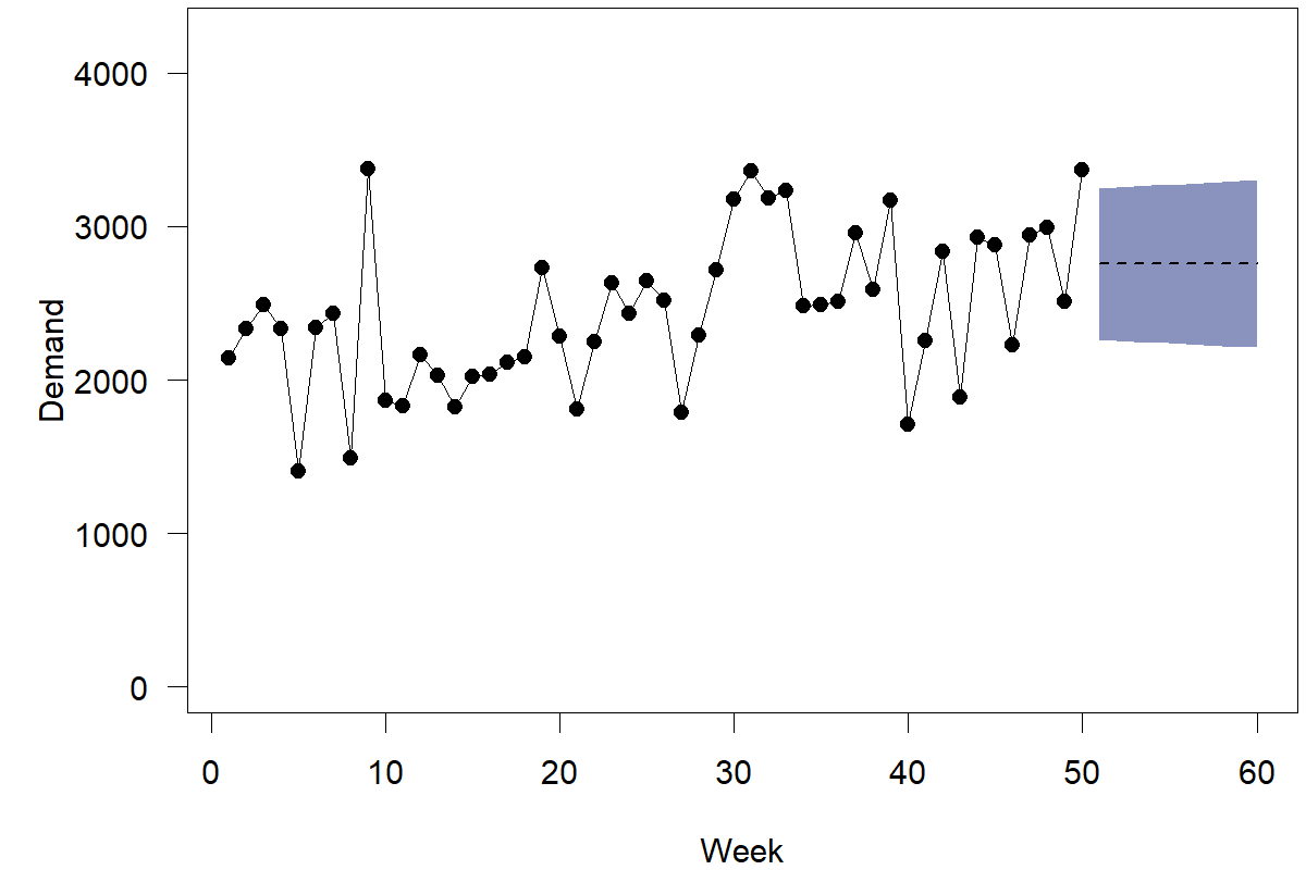
Figure 4.3: Demand, point forecasts, and prediction intervals
So what is the proper method to use? How do we come up with the correct prediction interval? Which standard deviation estimate works best? The common criticism against method (1) is that it under-estimates the uncertainty about the true forecasting model and does not incorporate the notion that the model could change. Standard errors are thus too low. Method (2) requires a lot of data to be effective. Method (3) is usually based on some assumptions and may not be robust if reality violates these assumptions. In practice, getting the right approach to calculate prediction intervals can require careful calibration and selection from different methods. Chapter 17 outlines how you can assess the accuracy of prediction intervals and compare different methods in practice. Generally, using any of the methods described here is better than using no method. While getting reasonable estimates of the underlying uncertainty of a forecast can be challenging, having any estimate is better than assuming that there is no uncertainty in the forecast or supposing that all forecasts have the same inherent uncertainty.
4.3 Predictive distributions
The preceding sections highlight that forecasts can consist of a single point (point forecasts) or an entire prediction interval. These different representations of a forecast are all stepping stones toward describing the probability density of future demand. We can go one step further and develop the complete probability distribution of each future outcome: the predictive distribution.
As a side note, prediction intervals are usually calculated based on an assumed density “under the hood.” Specifically, the algorithm uses an assumption of a probability density, feeds in parameters (like the expectation or the standard deviation), and extracts the prediction interval endpoints. Figure 3.1 shows the relationship between a predictive density and the extracted prediction intervals.
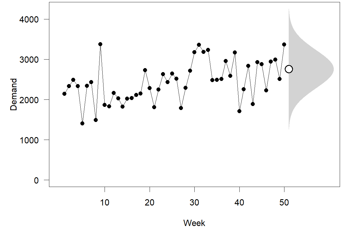
Figure 4.4: Demand, point forecast, and predictive density for the next observation
The most commonly assumed predictive density is a normal (or “Gaussian”) distribution, i.e., the familiar bell curve, as shown in Figure 3.1. Figure 4.4 depicts our ongoing time series example, emphasizing the point forecast and the predictive density for the next observation. We rotated the bell curve by 90 degrees to align it with our time series plot. We could also calculate and plot point forecasts and predictive densities for periods further ahead in the series. Since the point forecast is the same for all future periods (compare Figure 4.3), all these densities would have the same center. But since we become less and less sure the further we predict into the future, the prediction intervals will get wider and wider, as we illustrated in Figure 4.3. Similarly, predictive densities that look farther ahead will also widen.
Realistically, predictive densities for different time points in the future can look very different. Figure 4.5 shows a time series of daily SKU demand at a single retail store from the M5 competition data. The time series exhibits day-of-week seasonality. More people tend to visit the store to purchase the product on weekends. We see in the plot that average sales tend to increase over the next week – but the predictive densities also widen. To satisfy this demand, we would need a higher safety stock on the weekend to achieve a target service level in the face of increasing predicted demand variance. A fixed safety stock for the week would lead to a lower service level (i.e., increased stockouts) on Fridays and Saturdays.
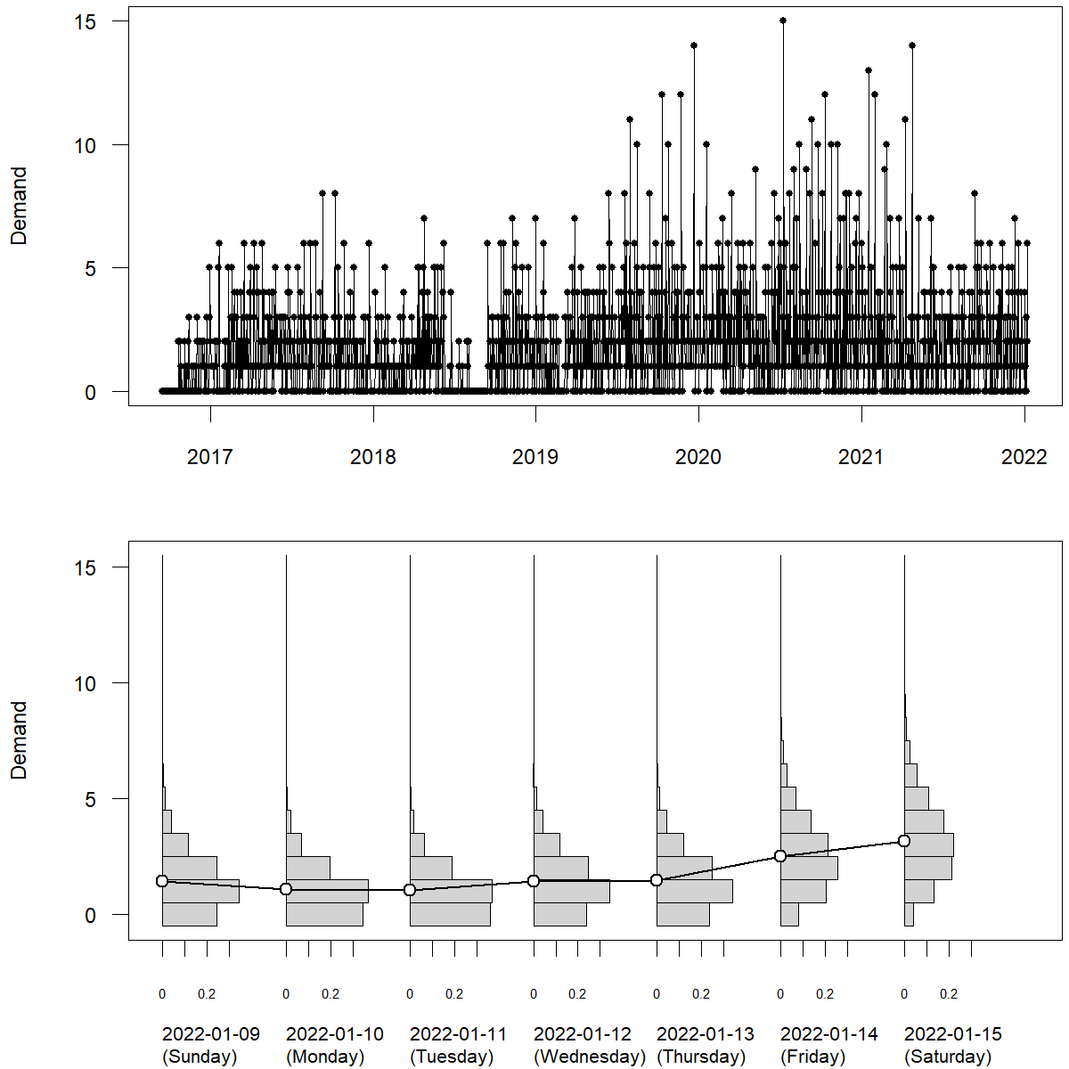
Figure 4.5: Daily SKU \(\times\) store level retail sales: demand (top), point forecasts and discrete predictive densities (bottom) for the next seven observations
How can we calculate predictive distributions in practice? There are a number of commonly used methods. First, many standard time series forecasting methods will output a point forecast (as above) and an estimate of the standard deviation of future observations around that point forecast. If we can assume a normal (Gaussian) distribution of future observations, then we can just plug in the point forecast as the mean and this standard deviation to obtain the full predictive density. Second, we can collect the residuals between the historical observations and the in-sample fit. If we can assume that these residuals are representative for future forecast errors, then arranging them around the point forecast yields a predictive distribution. Third, one can fit use statistical or Machine Learning methods to forecast not the expectation of future observations, but many quantiles (using a pinball loss as a loss function), i.e., forecasts that aim at exceeding the future observation with a prespecified probability of 1%, 2%, , 99%. The collection of many such quantile forecasts (almost) yields a full predictive density. However, as we see from this description, calculating a full predictive density is a somewhat bigger challenge than getting a single point forecast.
4.4 Decision-making
Given that we now understand how to estimate the parameters of a probability distribution of future demand, how would we proceed with decision-making? Suppose we aim to place an order right now with a lead time of 2 weeks. Suppose we also place an order every week so that the order we place now has to cover the demand we face in week 53. Further, suppose we have perishable inventory, so we do not need to worry about existing inventory quantities or stocks left over from week 52. The inventory we have available to meet the demand in week 53 is equal to what we order right now. In this case, we would provide a demand forecast with the three-week-ahead forecast (= 2752) and the three-week-ahead standard deviation (= 488.80). It is essential to match the correct forecast (three-week-ahead) with the right forecast accuracy measure (three-week-ahead, and not one-week-ahead, in this case). Suppose we want to satisfy an 85% service level; the quantile forecast associated with an 85% service level is 3260 units; according to our forecast, this order quantity would have an 85% chance of meeting all demand.
This discussion concludes our simple example. Key learning points for readers are understanding the mechanics of creating point forecasts and prediction intervals for periods in the future and how these predictions can translate into decisions. We will now proceed to provide more detailed explanations of different forecasting methods.
Key takeaways
Calculating a forecast is not necessarily rocket science.
Forecasts come in three versions in increasing order of sophistication: point forecasts, prediction intervals, and predictive densities.
Correct predictive densities encode all the information we have about the future of a time series, but we can already improve decision-making using good point forecasts and prediction intervals.