11 Causal models and predictors
The time series forecasting methods discussed in the previous chapters require only a time series history. No additional data are needed to calculate a simple forecast or to estimate model parameters. However, organizations often have various other pieces of information beyond the time series history. Examples may include consumer confidence indices, advertising projections, reservations, population change, weather, etc. Such data may explain variations in demand and could serve as the basis for more accurate demand forecasts. Using such information is the domain of causal modeling or regression modeling.
For instance, suppose you are interested in producing a monthly sales forecast of a particular product in a company. You want to investigate the association between advertising expenses and sales. The goal is to develop a model that you can use to forecast sales based on advertising expenses. In this setting, advertising expenses are an input variable, while sales are an output variable. The inputs go by different names, such as predictors, features, drivers, indicators, or independent, exogenous or explanatory variables. The output variable is often called the response, or the explained, dependent or forecast variable. Throughout this chapter, we will use the terms “forecast variable” for the output and “predictor” for the input.
11.1 Association and correlation
This section examines how to describe and model an association between two or more variables, and to leverage it in forecasting. To be more precise, we are interested in the association between the forecast variable (e.g., demand or sales) and some potential predictors (e.g., advertising expenses, price or weather). The critical question is whether knowing the values of predictors provides any information on the forecast variable. In other words, does the knowledge of a predictor’s values increase forecast accuracy? For example, if weather and sales are independent, then knowing the weather forecast does not increase sales forecast accuracy. There is no value in including it in the model. But if promotions influence sales, learning about promotions in advance and incorporating this predictor into a forecasting model will increase accuracy.
A scatterplot is a convenient way to demonstrate how two numerical variables are associated. We could, in addition, quantify the association using a numerical summary. There are many ways to do so. The Pearson correlation coefficient may be the most commonly used (Benesty et al., 2009). This coefficient measures the strength and direction of a linear association. (Other correlation coefficients, like Spearman’s or Kendall’s, also measure non-linear – but still monotonic – correlations.) The Pearson correlation coefficient \(r\) can take any value between \(-1\) and \(+1\). A perfect correlation, i.e., \(r = +1\) or \(r = -1\), would require all data points to fall on a straight line. Such a correlation is rare, because of randomness.
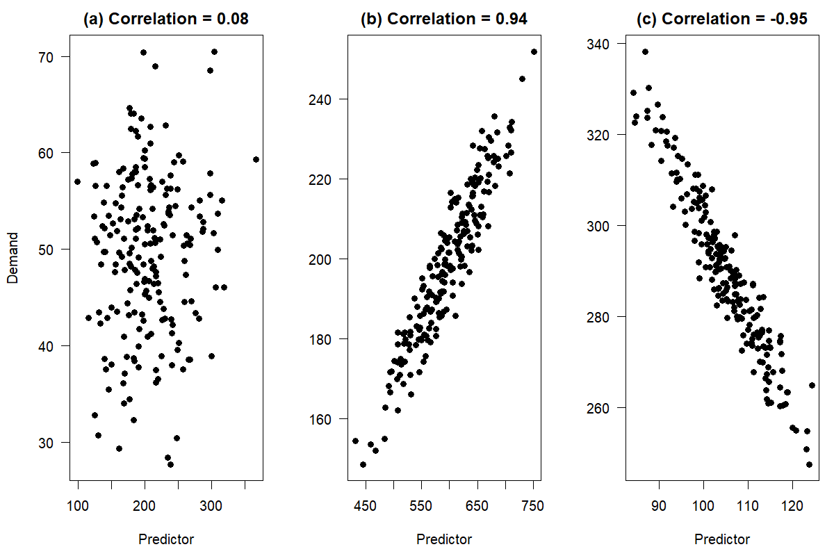
Figure 11.1: Correlations between two numerical variables
Intuitively, if there is no relationship between variables, we would expect to see no patterns in the scatterplot. It will be a cloud of points that appears to be randomly scattered. We observe this in Figure 11.1(a). Demand seems to have no particular pattern, regardless of the predictor’s value. We would not expect including this predictor in a model to lead to more accurate demand forecasts. On the other hand, Figure 11.1(b) and (c) illustrate examples with a strong positive and negative linear association between demand and the predictor, respectively. As the predictor changes on the horizontal axis, so does demand on the vertical axis. In both cases, knowledge of the predictor value provides information about the corresponding demand, and including the predictor in a causal model will likely improve forecasts.
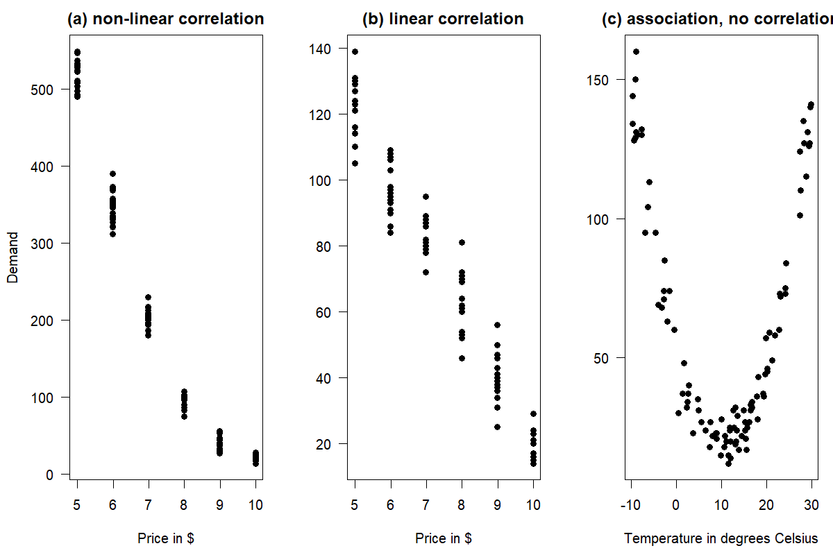
Figure 11.2: Association vs. correlation between two numerical variables
The terms “association” and “correlation” are sometimes used synonymously, but they do not mean the same thing. While a correlation is more specific, measuring a monotonic (typically linear) association between two numerical variables, association is a more general term and could refer to any linear or non-linear relationship. Figure 11.2 illustrates the difference. Figure 11.2(a) shows a non-linear correlation between price and demand: a price change from $9.99 to $8.99 yields a much smaller demand uplift than a price change from $5.99 to $4.99. Figure 11.2(b) shows a linear correlation, where every price reduction by $1 yields about the same additive demand uplift. Both linear and non-linear correlations are associations. Finally, Figure 11.2(c) shows a clear association between temperature and demand, e.g., for sunscreen in a mountain resort: low temperatures happen in winter, when skiers need sunscreen, high temperatures correspond to summer, where hikers need sunscreen, and middling temperatures correspond to the off-season in spring and fall with low demand for sunscreen. Temperature and demand are uncorrelated since there is no linear relationship between the two, but of course, the obvious association will help us forecast better (given good weather forecasts).
Many forecasters use the correlation coefficient to check for an association between variables in a dataset. However, this measure can be misleading. Examine the scatterplot in Figure 11.2(a). The association between price and demand is not linear. However, we can still calculate a correlation coefficient. The Pearson correlation in this example is not very useful, since the underlying relationship is non-linear. Further, Figure 11.2(c) has a zero correlation between temperature and demand. This measure is again misleading, as it does not capture the clear non-linear association between the two variables.
In summary, we should only calculate the Pearson correlation when we need to measure the linear strength between two numerical variables. We should not use this measure when there is a non-linear association; otherwise, you get deceiving results. Figure 11.2 also reiterates the importance of plotting your data using a scatterplot and not exclusively relying on the correlation coefficient when trying to understand data.
An essential step in building causal models is identifying the main predictors of the variable you want to forecast.
11.2 Predictors in forecasting
Useful predictors are available (or predictable) early enough in advance, not prohibitively costly, and improve forecasting performance when used in a forecasting model. Of course, the cost of obtaining predictor data has to be judged compared to the improvement in forecasting performance that will result from using it.
A useful predictor needs to provide more information than what is already contained in the time series itself. For instance, weather data are often subject to the same seasonal effects as the time series whose forecasts we are actually interested in, e.g., the demand for ice cream. Simple correlations between a predictor and the focal series can result from their joint seasonality. In this case, simply including seasonality in the model may make modeling the predictor superfluous. A key to a successful evaluation of the performance of predictors is not merely to demonstrate a correlation or association between the predictor and your demand time series, but also to show that using the predictor in forecasting improves upon forecasts when used in addition to the time series itself.
To use a predictor for forecasting, we need to know or be able to forecast its values for the future. We may be able to predict our own company’s advertising budgets rather well. Public holidays, concerts, festivals, or promotions are categorical variables known in advance. Conversely, assume that we wish to forecast the sales of a weather-sensitive product like garden furniture or ice cream for the next month. If the weather is nice and sunny, we will sell more than if it is rainy and wet. However, suppose we want to use weather information to improve forecasts. In that case, we must feed the forecasted weather into our causal forecast algorithm. Of course, the question is whether we can forecast the weather sufficiently far enough into the future to improve sales forecasts that do not use the weather – where we assume we have already included seasonality in our “weatherless” forecasts, since these products are typically strongly seasonal.
Importantly, when evaluating the performance of your forecast that leverages weather data, you need to ensure that you don’t assess your out-of-sample forecasts based on how they work with actual weather. You will not know next week’s actual weather when you produce the forecast for the next week. You need to assess the forecasts based on weather predictions. The uncertainty in these weather predictions adds to the uncertainty in your forecasting model, which ultimately affects the forecast accuracy (Satchell and Hwang, 2016). It is thus very much recommended to begin the search for useful predictors with those whose values we know in advance (deterministic predictors), rather than those that require forecasting themselves (stochastic predictors).
Sometimes the association between a predictor and an outcome is not instantaneous. In the following sections, we will discuss leading and lagging predictors as two important sources of information.
11.3 Leading and lagging predictors
A leading predictor (especially in macroeconomics often called a leading indicator) is a numerical or categorical predictor time series containing predictive information that can help increase forecast accuracy for a different forecast variable at a later point in time (the predictor “leads” the focal time series). Examples would be housing starts as a leading predictor for roof construction, higher inflation today leading to less economic activity later, a higher volume of calls received in a clinical desk service leading to higher demand for emergency room service a few hours later, or a promotion on a product today leading to lower demand next week, because customers have stocked up on the product (“pantry loading”).
In contrast, there are also lagging or lagged predictors (again, often called lagged indicators), whose effect follows, or lags behind the predictor. For example, if customers know that a product will be on promotion at a lower price point next week, they may refrain from buying it today, so today’s demand is lower because of next week’s promotion. And known regulatory or tax law changes that will take effect months or years from now may have an impact on economic activity today: fewer companies will invest in building new gas stations if sales of internal combustion engine cars will be illegal two years from now.
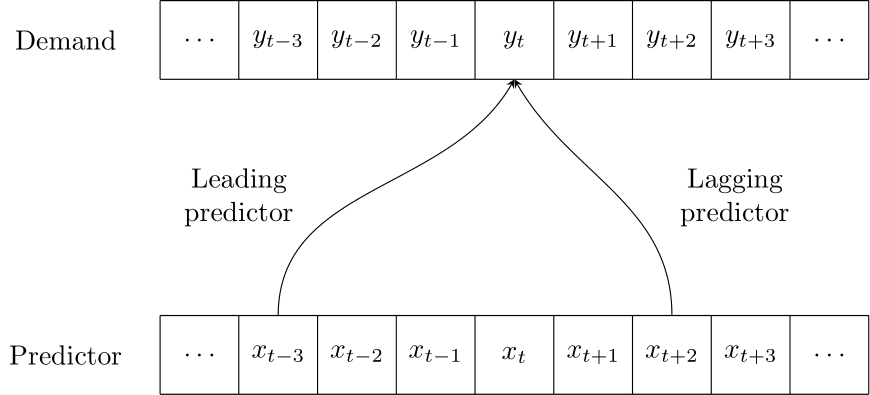
Figure 11.3: A leading or lagging predictor for demand
We see that predictors can have an impact over multiple time periods: a promotion may lead to higher demand during the promotion, but lower demand after the promotion (because people have stocked up) or even before the promotion (if customers can predict the promotion, e.g., if promotions on a given product happen regularly or are communicated in advance). Figure 11.3 illustrates the effect of a leading or lagging predictor.
11.4 An example: advertising and sales
To illustrate the use of predictors, consider a dataset on sales and advertising. The dataset contains monthly sales and advertising expenses for a product between January 2005 and August 2021 (Kaggle, 2023). One could apply some form of Exponential Smoothing to the sales data to create a forecast – or one could attempt to use advertising expenses as a predictor for sales.
An easy way to examine whether advertising expenses are associated with higher sales is to calculate the correlation coefficient between these variables during the same period. The left panel of Figure 11.4 gives a scatterplot of the dataset with its correlation coefficient.
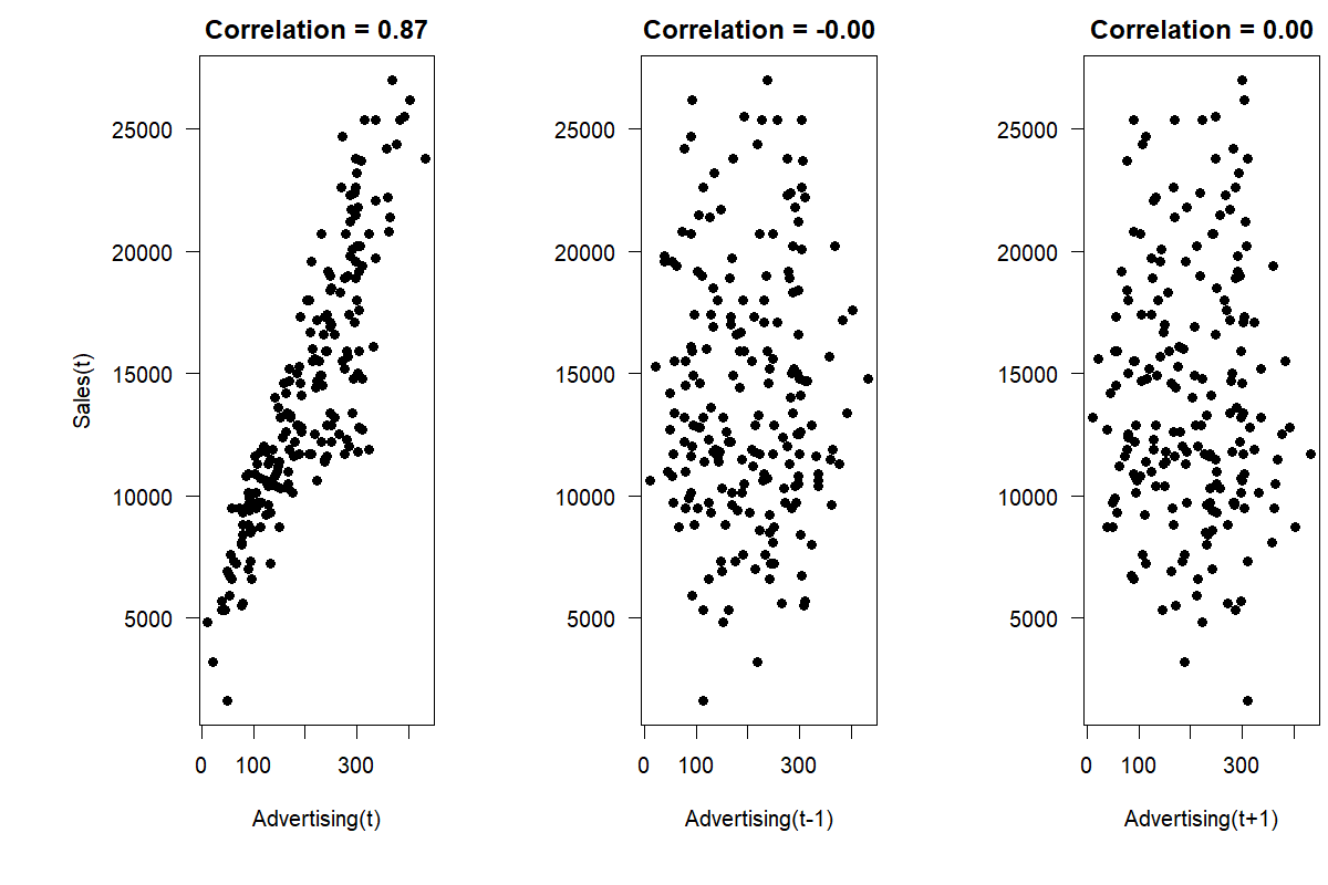
Figure 11.4: The association between time series on sales and advertising (left), as well as the association between sales and lagging advertising (center) and leading advertising (right)
So is advertising a useful predictor? The first relevant question would be whether we know a month’s advertising expenses in advance. Usually, firms set advertising budgets according to some plan so that many firms will know their advertising expenses for a future month in advance. However, the time lag with which this information is available effectively determines the possible forecast horizon. If we know advertising expenses only one month in advance, we can use this information for one-month-ahead predictions only. As highlighted in Figure 11.4, the association between sales and advertising is strong and linear. Therefore, advertising should be considered as an essential predictor of sales when building the forecasting model.
Revisiting Figure 11.4, we can investigate whether there is a time lag between spending money on advertising and these expenses having any influence on sales. Advertising is sometimes seen as filling the front end of a funnel, starting the customers on their journey. Using lag plots (see Figure 6.7), one can check for a possible time lag by visualizing the association between sales and previous or later advertising expenses. Additionally, we can compare the correlation coefficients from the current period (\(r = 0.87\) for the example data above) to the correlation between sales and last month’s advertising expenses (\(r = 0.00\)), or even the expenses from one month later (\(r = 0.00\)). The correlation is strongest between the current advertising expenses and sales, indicating that a time lag between these variables is not essential for forecasting in this example. If we had found a stronger relationship between sales and leading or lagging advertising, we could have continued our analysis by considering longer lag or lead times.
11.5 Correlation, causation and forecasting
While we use the term “causal models” in the title of this chapter, truly establishing causality is very different from showing a correlation or estimating a regression equation (Pearl and Mackenzie, 2018). Doing so requires an association between one variable and another, temporal precedence, and the exclusion of alternative explanations. In our example of advertising and sales, one could argue for reverse causality (i.e., it is not advertising that is driving sales, but sales that is driving advertising, because higher sales may increase the budget available for advertising) or alternative explanations (i.e., if companies advertise, they also stock more product, leading to higher service levels and sales).
The gold standard in establishing causality is the randomized controlled trial. One assigns a treatment, i.e., a manipulation of an input variable, at random to one of two similar groups – the treatment and the control groups. One can then establish causality by comparing both groups’ outcome measurements afterward. While going through this process is often tricky in practice (running a promotion in only half of stores risks alienating customers), the methodology of improving websites through A/B testing is similar to a randomized trial.
For non-experimental data, causality is empirically hard to establish. However, the field of econometrics has made much progress in recent years to examine causality better. We refer interested readers to Angrist and Pischke (2009) for a good overview of these methods. Examples of these methods include difference-in-difference analysis, where we compare a treated group over time to a similar non-treated group. Or regression-discontinuity approaches, where we examine “close calls” in our data. For instance, suppose we want to examine the effect of unionization on outcomes. In that case, we focus our analysis on only the sites where the vote to unionize was very close and could have gone either way. Whether the site ended up unionized or not is thus somewhat randomly determined. Comparing those “close call” sites that unionized to those that did not is thus almost like comparing treated and control groups in a randomized controlled trial.
Establishing a causal association helps us understand why a predictor explains variation in the forecast variable. This understanding can increase trust in the model and lead to a higher chance of implementation and use in practice. Without establishing causality, an observed association or correlation could be spurious, i.e., not driven by a “true” causal link, but merely due to random noise.
We emphasize that forecasting does not require a causal relationship; in this sense, it is a very pragmatic profession. As long as data enable us to predict the future better, we do not need to be sure that the underlying relationship is genuinely causal in the sense of, e.g., Pearl and Mackenzie (2018). While we can have more confidence that the relationship we use for forecasting remains stable over time if we understand the underlying causality, being unable to demonstrate causality does not necessarily prevent us from exploiting an empirical relationship to make predictions. If we know that a statistical relationship exists between the number of storks in a country and its birth rate (\(r = 0.62\); see Matthews, 2000), can we use this relationship to predict the birth rate of a country for which we only know the number of storks fluttering about? The answer is yes. Exploiting this relationship may be the best we can do without other data. However, understanding causality may lead us to better predictors. In this case, the number of storks in a country relates to country size, which relates to birth rates. Using country size will probably lead to better predictions of births than using the number of storks.
In this context, big data provides forecasters with new opportunities to find predictors for their time series. Google, for example, provides a tool available for free: Google Trends (Choi and Varian, 2012). Google Trends allows forecasters to examine the frequency of specific search terms relative to all searches over time. An example focusing on end-consumer personal consumption expenses in different categories shows how incorporating this information into standard forecasting methods can increase forecasting accuracy (Schmidt and Vosen, 2013). Google Trends also allows downloading and using this data for real-time forecasting.
Big data could mean more predictors and potentially more helpful associations. However, if there are too many predictors but too few observations per predictor, then spurious relationships are more and more likely to appear. In other words, big data may mean more information but also more false information (Taleb, 2014, see also Section 11.7 below).
11.6 Combination with time series
Let us return to our advertising and sales data from Section 11.4. The critical question is how much we gain by using advertising data in our forecast. That is, how much better we can predict sales if we exploit the relationship between advertising and sales, as opposed to simply using the time series history of sales to predict the future?
To answer this question, we devise a simple forecasting competition (see Chapter 18) by splitting the dataset at hand into an estimation sample (January 2005 to August 2020) and a hold-out sample (September 2020 to August 2021). We use the estimation sample to estimate the relationship between advertising and sales; we use the hold-out sample to test the predictions of that model. Specifically, we will calculate a rolling origin forecast. That is, we take the history from January 2005 to August 2020, fit a model, and forecast for September 2020. Next, we move the forecast origin by one month, taking the history from January 2005 to September 2020, fitting a model and forecasting for October 2020, and so forth. In each step, we estimate the following regression equation using data from the current history:
\[\begin{align} \mathit{Sales}_{t} = a_{0} + a_{1} \times \mathit{Advertising}_{t} + \mathit{Error}_{t}, \tag{11.1} \end{align}\]
Estimating a regression equation here means finding values of \(a_0\) and \(a_1\) that minimize the squared values of \(\mathit{Error}_{t}\) across the estimation sample. We refer interested readers who require more background on regression to Richardson (2011) and Harrell (2015). We can estimate a regression equation in Microsoft Excel if we install the Analysis ToolPak or similar add-ons. In our case, in the first step, we estimate the equation to obtain the following estimates for \(a_0\) and \(a_1\):
\[\begin{align} \mathit{Sales}_{t} = 4,241.03 + 48.77 \times \mathit{Advertising}_{t} + \mathit{Error}_{t} \tag{11.2} \end{align}\]
These estimates indicate that every dollar spent in advertising is associated with $48.77 in extra sales for prediction purposes on average. We emphasize that estimating this regression does not establish a causal effect, and we should not necessarily use these numbers to plan advertising spending. However, if we know the advertising budget, we can multiply that number by 48.77 (and add 4,241.03) to predict sales in that period.
In the second step, we have one additional historical data point, so our estimated model changes slightly:
\[\begin{align} \mathit{Sales}_{t} = 4,177.95 + 48.74 \times \mathit{Advertising}_{t} + \mathit{Error}_{t} \tag{11.3} \end{align}\]
This rolling regression approach is easy to do for all 12 months in the hold-out sample (i.e., last year) and leads to a Mean Absolute Error (MAE; see Chapter 17 on forecast error measures) of 1,954 across the hold-out sample.
How good is this forecast? A reasonable comparison is a pure time series forecast that would not have required any information on advertising. To that purpose, we again used rolling forecasts to estimate Exponential Smoothing forecasts (as described in Chapter 9). The winning models across our 12 forecast origins generally were models with additive or multiplicative errors, without trends or seasonality. The resulting MAE from these model forecasts is 4,810, much higher than the MAE from our simple regression model.
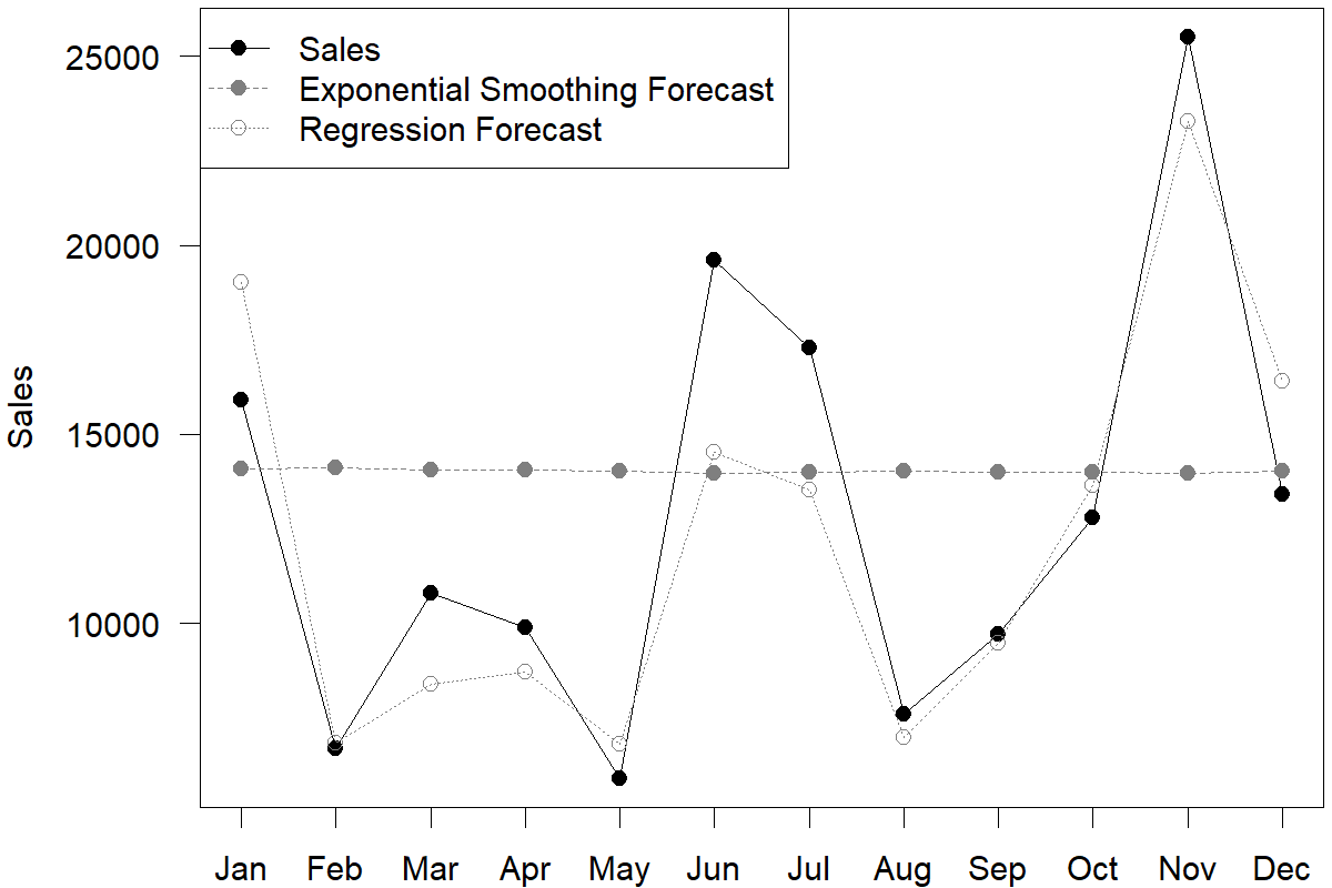
Figure 11.5: Rolling regression and Exponential Smoothing forecasts in the hold-out sample
We can see from Figure 11.5 that the two sets of forecasts are very different. Which forecast should one trust? The MAE from Exponential Smoothing models is higher. But does that mean that one should rely solely on advertising data? Or can these two methods somehow be combined to provide better forecasts?
One way to combine time series models with predictors is to allow the regression equation to estimate seasonal factors (and trends). To incorporate seasonality into our regression equation, we code 11 dummy variables in our dataset, one for each month except December (see Section 15.5). A code of \(1\) indicates that a particular observation in the dataset takes place in that specific month; the variables are \(0\) otherwise. If all variables are coded as \(0\) for an observation, that observation took place in December. We then estimate the following multivariate regression equation:
\[\begin{equation} \begin{split} \mathit{Sales}_{t} = a_{0} + a_{1} \times \mathit{Advertising}_{t} + a_{2} \times \mathit{January} + \cdots + \\ a_{12} \times \mathit{November} + Error_{t} \end{split} \tag{11.4} \end{equation}\]
This equation now accounts for seasonality according to different months. However, seasonality is additive in the model and cannot change over time. We calculate forecasts for the hold-out samples using this revised specification. The resulting MAE of 2,590 is worse than in the original regression model, indicating that incorporating seasonality in this fashion was not beneficial.
This question of forecasting with multiple methods has been studied extensively in the literature on forecast combination (compare Section 8.6). In our case, we could take the average of the Exponential Smoothing and the regression forecast. While such a strategy often works to improve performance (see Section 8.6), in our case, the resulting MAE is not improved, but increases to 2,861.
Finally, while we used a straightforward multiple linear regression model in this example, the same approach can be used instead with more modern Artificial Intelligence and Machine Learning tools. Most, if not all, of these can leverage predictors and seasonal dummies for forecasting. See Chapter 14 for more information on these methods.
11.7 Model complexity and overfitting
Our forecasts are never as accurate as we want them to be. One widespread reaction to this state of affairs is to search for more and more predictors and include them in a causal model. Unfortunately, there are two different problems with this approach.
The first problem is that the proposed predictor may only spuriously correlate with our outcome. If we mine all the available data, random noise means that there will always be some other time series that correlates well historically with our outcome. However, this correlation may be wholly spurious and useless in forecasting. (An internet search for “spurious correlations” yields many entertaining examples.) Unfortunately, humans are highly prone to seeing patterns where none exist (an effect known as pareidolia) and invent explanations why a given predictor is “really” related to the outcome of interest and so “should” have predictive power – even if it objectively doesn’t.
The problem gets even worse. Based on the preceding paragraph, we might think that including irrelevant predictors may not be helpful, but at least it will not harm us. Right? Sadly, this comforting thought is mistaken: adding spurious predictors to a model may actively make the model and the forecast worse. Why? Adding one predictor to a model changes the entire model. The estimated influence of all other predictors changes in light of the newly added one. If an additional predictor is only spuriously related to the outcome, including it in our model only adds noise. Since the entire model changes, this added noise makes the estimates for the impact of other predictors noisier. The result will be a more noisy (i.e., less accurate) forecast.
Another problem occurs when a predictor is indeed related to the outcome, but only weakly so. Including it in our model could lead to more accurate forecasts on average. However, the predictor will also make the entire model more noisy. Whether the improvement in performance by adding a variable is greater than the deterioration in quality caused by the higher model noise is uncertain. If a predictor’s effect is particularly weak, the added model noise by including this predictor will likely offset any accuracy improvement, making forecasts worse overall (Kolassa, 2016b).
This problem is a direct consequence of the bias-variance trade-off (James et al., 2021), and an example of overfitting. Every Data Scientist and forecaster should be aware of these concepts. Figure 11.6 shows the bias-variance trade-off and its relation to model complexity. If the model is simple and understandable, it will have a high bias and a low variance. Similarly, if the model is complex and challenging to understand, it will have a high variance and a low bias. There is a clear trade-off: as one increases, the other will decrease and vice versa. What is most important is the total error, which is the sum of the bias and the variance (the bias-variance decomposition of total error).
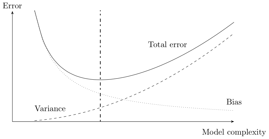
Figure 11.6: Model complexity and the bias-variance trade-off. The optimal model complexity – with the lowest total error – is indicated
Another relevant issue is the trade-off between model complexity and model interpretability. Figure 11.7 illustrates this trade-off for some of the methods that we cover in this book in Chapters 8 to 15. In general, as the complexity of a method increases, its interpretability decreases. However, it is often the case that multiple quite different models yield very similar forecasts (such a set of models has been called a Rashomon set by Fisher et al., 2019, after a 1950 movie directed by Akira Kurosawa, where multiple characters describe the very same event in wildly different ways). The critical question then is not to find the most accurate, but the overall best model within this set, in terms of accuracy, interpretability and other qualities like low runtime or memory requirements.
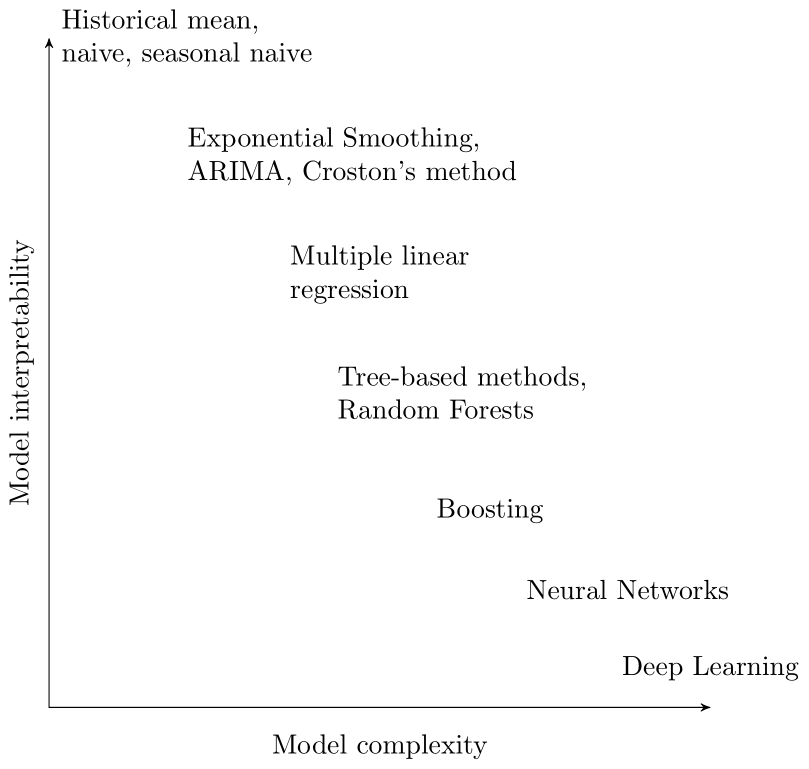
Figure 11.7: Model complexity and interpretability
Finally, it is essential to note that the effects described here do not only happen with causal predictors in the strict sense of the word. They can equally likely occur with trend and seasonality. Forecasting a weakly seasonal time series with a seasonal model may yield worse forecasts than with a non-seasonal model. Kolassa (2016b) gives a simulation example of a set of time series whose seasonality is evident in the aggregate but where a seasonal model yields worse forecasts than a non-seasonal model when applied to each constituent time series separately.
Key takeaways
Known predictors of demand can dramatically improve your forecast. Consider including them in a causal model.
It is not sufficient to demonstrate that a driver correlates with demand; rather, the cost of obtaining it needs to be outweighed by the forecast accuracy improvements it can bring.
A predictor’s influence on demand may lag behind or lead its occurrence and may influence more than a single period.
For forecasting demands with a causal predictor, we need to measure or forecast the driver.
More complex models do not automatically yield more accurate forecasts.